Sabtu, 30 Januari 2010

Patrick Hughes - Painter, "Reverspective"


Reverspectives are three-dimensional paintings that when viewed from the front initially give the impression of viewing a painted flat surface that shows a perspective view. However as soon as the viewer moves their head even slightly the three dimensional surface that supports the perspective view accentuates the depth of the image and accelerates the shifting perspective far more than the brain normally allows. This provides a powerful and often disorienting impression of depth and movement. Patrick Hughes takes full advantage of this effect in his use of surrealist images that reinforce the altered reality of the viewer.

The illusion is made possible by painting the view in reverse to the relief of the surface, that is, the bits that stick furthest out from the painting are painted with the most distant part of the scene. This is where the term reverse perspective or Reverspective comes from. A more detailed explanation of the relationship between perspective and Reverspective can be found in the next section. For the technically inclined in depth discussion can be found in the various scientific papers on this site.
- Patrick Hughes Web Site

Link Patrick Hughes, YouTube, Part 2

Link Patrick Hughes Web Site

Senin, 25 Januari 2010

How We Look At Art And Why it Matters - A Lot.


Willem de Kooning, Gotham News, Oil on Canvas, 1955


Why do we go to museums? Why do we seek out certain art works? What do we learn from looking? How do we maximize our experience?


Obviously, we visit museums to enrich and expand our cultural lives. A majority of casual viewers may approach viewing an art work the following way:

1. Historical Context

2. Narrative Content

3. Personal Stylistic Preferences

4. Artist's Name Recognition

5. Because it is different or obviously provocative.

This approach might be improved. As is, it may result in superficial experiences and projections because there is no mechanism for the viewer to better understand the characteristics and expressions of a specific work. This might be enough for many. But, how do we get closer to the meaning of the work? A general and casual approach results in general and casual conclusions.

The questions we ask ourselves while looking at an art work matter. To better gather our experiences, long contemplation with an open inquisitive mind is necessary. Changing the way we look at art challenges and influences basic assumptions. This is very difficult to accomplish because it is an active process requiring commitment and effort.

1. Let go of any preconceived ideas or prejudice about the art work or style. This is much harder to do than it sounds.

2. Relax and allow the art work to influence or lead your eye. Where does it go, how does it travel? Shut your eyes. Open them and allow the art work to lead your eye again. Does it travel the same way or differently? What areas are your eyes attracted to? Do this many times noting the similarities and differences of each experience. Stand at different distances and angles to the work and view it again and again.

3. How has the artist organized the art work to cause your eye to move in this way? Take your time to think about this question. Be thorough and considerate. What colors, values, lines, textures, and shapes are used and how are they placed on the the surface? Is there an overall geometrical structure? Do you see any large simple geometric shapes or a shape motif?

4. Describe the pictorial space. Is it deep, shallow, both? Does it seem flat and spacial at the same time? Is it heavy with atmosphere? What is the quality of the light, the color? Is there an obvious light direction? How does the pictorial space influence you?

5. What role does time, or timelessness, play in the picture?

6. Describe the quality of the surface, the marks? How does the quality of the surface add to the meaning?

7. What is the size of the image? How does the size influence you, and what are some expressive reasons for the size?

8. What are the descriptive qualities? If the art work is "representational" what are the characteristics of the representation? Is it clear, clean, detailed? Is it about suggestion and less detail? How does this influence meaning specifically?

9. If the image contains a person or people, how are they portrayed and for what purpose? What role does gesture play? What do you experience as you look at the person or people? How do you relate to them?

10. During your thorough investigation, what thoughts and feelings are generated within you by the art work? Connect and anchor your thoughts and feelings to the art work and to specific visual decisions made by the artist.

11. Consider the historical context. When and where was the art work created? What was the political climate, the artist's reputation? How was the particular art work received in its day? What was its purpose?

12. If there is a narrative? What is the story and how is it told? Compare it to renditions by other artists of the same time and culture, and to artists of different times and cultures. What was the significance of the narrative within the culture? Be specific.

13. What is the provenance and how does this contribute to our understanding of the aesthetic, monetary, and cultural value of the work?

14. Seek out and study professional opinions about the particular work. Question and vet the conclusions drawn by the author.

This is not meant to be a definitive process or a sequential list. But, by using this approach you are more likely to uncover a specific experience with a specific art work. Like a close reading, it encourages longer contact and thorough consideration. Trust your eyes.

Kamis, 21 Januari 2010

How To Pick An Animation School? The ASIFA - Hollywood Animation Archive


Excerpted from The ASIFA - Hollywood Animation Archive Blog by Steven Worth, Director

...the most common question I'm asked by young artists is, "How should I pick an animation school?" They always expect me to recommend a specific school, but my answer usually surprises them. Before I tell you the advice I give them, take a look at this past post...

Carlo Vinci: The Training Of A Golden Age Animator.

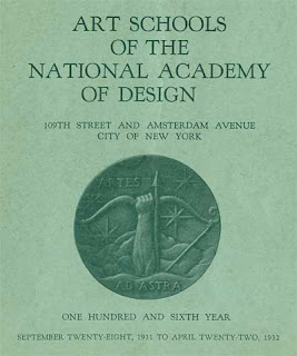
...This is the course outline for National Academy of Design, the art school that Carlo Vinci attended... I hope you take the time to read over this material carefully, especially if you are a student looking to pursue a career in animation. It will help you know what to look for in an animation school.

The Academy believes firmly in the development of individuality but denies that such development is helped by the ignoring of the universal heritage, the heritage of the graphic manifestations of Man's temperament and impressions. It therefore approves careful consideration of the Art of the past and its correlation with the Art of the present. It encourages progressive experiment admitting the vitality of real Art under any form and condemning only ignorance, insincerity and the contempt which is born of them.

The class schedule runs six days a week from 9 in the morning until 4 in the afternoon. First year studios in drawing from sculpture, life drawing, portrait painting, still life painting, and composition run from two to three hours apiece. Second year courses consist of life drawing, sculpture from life, portrait painting, etching, composition, and mural decoration. And three hour night courses are offered in sculpture, life drawing, drawing from sculpture and composition.

First year students receive lectures in anatomy, perspective and art history. Second year students attend lecture classes in color theory, various printing techniques, stained glass, mosaic and the history of art and architecture.

Note that students first draw from still life and sculpture, and only when they have proved their abilities, are they allowed to advance to drawing from life.

How to Pick An Animation School?

Here's the surprising answer... You don't! Schools that specialize in animation as a trade do a lousy job of preparing you for a career in animation. While you're a student, you should focus on your core art skills- drawing, design, composition and color. Look for a school that can give you a solid classical art background. Avoid ones that just teach computer programs. You don't have to spend thousands of dollars to learn Maya!

Carlo Vinci was one of the greatest animators who ever lived, but he never took a class in animation. Instead, he spent three years of intense study to learn to be an artist. With the experience he gained at the National Academy of Design, he was able to learn animation and advance quickly on the job. It was the same for great animators like Marc Davis, Chuck Jones and Frank Thomas who studied at Chouinard on the West coast. - Steven Worth

Link Full Text, Course Outline, Student Examples at The ASIFA - Hollywood Animation Archive Blog
Link The ASIFA - Hollywood Animation Archive Blog

Selasa, 19 Januari 2010

"I Have Seen A THOUSAND FACES"


"THE HUMAN FACE, with its infinite range of expression, is an ever-changing
reflection of the story of humanity. Now, from hundreds of photographs, the
editors of CORONET have selected a distinguished gallery to bring you a new
interpretation of that ageless story...

...I have seen a thousand faces, old and young. More eloquent than words, each speaks to me. Not on their lips, but in their eyes is sung the sorrow and the song of life's brief melody...

...I have seen a thousand faces, all the rest are lost, like blades of
grass that crowd upon a sod. And of a thousand passed, these I remember best-
The quiet faces brushed by the waiting hands of God." -J.P. Folinsbee

Source - Late Night Coffee Shops Blog, Stephen Worth, Coronet Magazine,
September, 1949.

Link Full Text and Photographs, Late Night Coffee Shops Blog, Stephen Worth

Senin, 18 Januari 2010

What Type Are You? - Interactive, Pentagram Design


Pentagram Image

Why did Brian Wilson use Cooper Black on the cover of Pet Sounds? Why did Obama use Gotham for his election propaganda? It has long been apparent that typefaces reflect the character of the person using them, and that type choice, as well as the words that are typed, is a powerful conveyor of meaning.

At Pentagram, we wanted people to be able to understand that meaning properly and use it more consciously. Hence our ‘What Type Are You’ application. Researched over seven years with a team of 23 academics across Eastern Europe, ‘What Type Are You’ asks the four key character questions of our day, analyses your responses in exceptional detail and recommends one of 16 typefaces as a result.

The recommendation is sometimes controversial but always unerringly true. Said one respondent, “At first I felt angry when I was told my type is Pistilli Roman but two weeks later, I was completely reconciled to it. Now I wonder why I ever thought I was a Gill Sans.”

Go to the ‘What Type Are You’ test. Password: character.

Project Team: John Rushworth, partner-in-charge and designer; Kirsty Whittaker, designer. Written by Naresh Ramchandani. Produced by The Brown Studio. Web development by Nerv Interactive. - source, Pentagram website via Design Observer website


Link Pentagram Design

Link Design Observer

Jumat, 15 Januari 2010

RISD - Foundation Studies, Video Overview


Link Rhode Island School of Design
Link RISD, Foundation Studies, Drawing

Kamis, 14 Januari 2010

Ingres, Holbein, and Egon Schiele?


Ingres


Holbein


Schiele


Line and its masterful use to explain, evoke, and create pictorial ideas is well demonstrated by these three very different artists.


In early to mid 1800s France, Jean August Dominique Ingres was considered the most prominent artist of his day. His powerful visual ideas continue to influence artists. Similar to music counterpoint, he brilliantly used line to turn form, establish rhythms, focal points, weight, light, volume, and flatness. Many of his drawings explore the identity of a specific person or group within the context of society and social position. At the same time, the example reveals the delicate interaction of love and family.


In the England of King Henry the VIII, Holbein held the powerful and very political position of Court painter. His remarkable portraits still strongly resonate with the human condition. Complex content generated with only line, he used his considerable technical prowess to communicate thoughts and feelings clearly with this most basic visual element. His drawings sharply reveal what his sitters think about themselves.


Active in the early 1900s, Austrian painter Egon Schiele immerses us in gesture, provoking and stirring basic instincts with his use of line and figure. His understanding of gesture is related to mime and dance. Like the example, many of Schiele's drawing are seductive, highly emotional, and sexually charged.


Link Igres, Wikipedia
Link Holbein the Younger, Wikipedia
Link Egon Schiele, Wikipedia

Rabu, 13 Januari 2010

Edmond de Goncourt - Art Critic


Edmond de Goncourt, Pen/Ink, c. 1873-1896, 15" x 10," Ernst Friedrich von Liphart

"A painting in a museum hears more ridiculous opinions than anything else in the world."

Edmond de Goncourt
French art critic & novelist (1822 - 1896)

Edmond de Goncourt (May 26, 1822 – July 16, 1896) was a French writer, literary critic, art critic, book publisher and the founder of the Académie Goncourt. He was born Edmond Louis Antoine Huot de Goncourt in Nancy, France.

He bequeathed his entire estate for the foundation and maintenance of the Académie Goncourt. In honor of his brother and collaborator, Jules Alfred Huot de Goncourt, (December 17, 1830 – June 20, 1870). Each December since 1903, the Académie awards the Prix Goncourt. It is the most prestigious prize in French language literature, given to "the best imaginary prose work of the year".

Marcel Proust, Simone de Beauvoir, Michel Tournier, Marguerite Duras and Romain Gary (who exceptionally won it twice) are among the best-known authors who have won the century-old prize.

Edmond de Goncourt died in Champrosay in 1896, and was interred in the Cimetière de Montmartre in Paris. - Wikipedia

Link Edmond de Goncourt, Wikipedia

Senin, 11 Januari 2010

Color Field Painter Kenneth Noland Dies. Career Beginnings in DC


Kenneth Noland (American, 1924-2010). Spread, 1958. Oil on canvas. 117 x 117 in. (297.2 x 297.2 cm). Gift of William S. Rubin, 1964.20. Grey Art Gallery, New York University Art Collection.© Kenneth Noland / Licensed by VAGA, New York, NY

The brilliant colors of painter Kenneth Noland’s concentric shapes and stripes dimmed Tuesday (1/5/10) when the founding Color Field artist died in Maine. Noland, who was 85, lost his battle with cancer after an expansive career that began in the immediate aftermath of Abstract Expressionism. He used that as the foundation for his postwar style known as Color Field, in which he stained canvas with vibrant washes of color into circles, chevrons, stripes, and diamonds. “He was one of the great colorists of the 20th century,” art critic Karen Wilkin said. “He picked up where Matisse left off and moved painting into a new visual language.”
Noland first picked up a paintbrush after a visit to the National Gallery in Washington at 14, which left him particularly fascinated with Monet. But it was Matisse who greatly affected the chromatic master’s ideas about art, prompting him to develop “color structure.” Despite the art world’s return to less abstract art, Noland stuck by his staining and free-form shapes on large, sometimes oddly shaped canvases, knowing, like the circles he often painted, “young artists will return” to the form he established...
...Exposure to the work of Matisse in Paris profoundly affected Mr. Noland’s ideas about art and inspired him to develop what he called “color structure. Returning to the United States, he settled in Washington, where he taught at the Institute of Contemporary Arts and the Catholic University of America, and became friends with the somewhat older Morris Louis, a fellow teacher at Washington Workshop Center of the Arts, an evening art school.
Both men, under the influence of Ms. Frankenthaler, began experimenting with stain technique, thinning their paint and applying it to unprimed canvas to create translucent layers of color that revealed the canvas surface. This approach dovetailed perfectly with (Art Critic, Clement) Greenberg’s dictum that the destiny of painting, as it approached pure self-referentiality, was to become ever flatter... - NYTimes via The Daily Beast

Link Daily Beast Obit, The Cheat Sheet
Link Full Text, NYTimes
Link Google Images

Kamis, 07 Januari 2010

Hans Holbein and Portraiture -"Clear Eye, Flawless Touch"


Portrait of Sir John Godsalve. Black and coloured chalks, watercolour and bodycolour, brush, pen and ink on pink-primed paper, 14.5"× 11.6", Royal Collection, Windsor Castle, 1532-33.

...Nobody, one may morosely predict, will ever draw the human face as well as this again. The tradition is cut, the bow unstrung. But the drawings remain—abraded, retouched, sometimes (as in a study of the bony, intense face of Bishop John Fisher) vandalized by later hands, yet through it all, radiating an almost incredible freshness of scrutiny. What strikes one first about them is their self-evident truth. Nobody else got the knobbly, mild face of English patrician power so aptly, or saw so clearly the reserves of cunning and toughness veiled by the pink mask. The idea that Holbein was criticizing his subjects is, of course, absurd; and yet his rapport with them was so acute that he could render their unease at the unfamiliar sensation of being limned. Young Sir John Godsalve, one of whose offices was resonantly called the Common Meter of Precious Tissue, is watching Holbein as Holbein watches him: calm and yet withdrawn to the fine edge of nervousness. It is the look people used to direct at cameras a hundred years ago, before everyone got used to the lens... Robert Hughes, Time Magazine, June 20,1983

Art: Clear Eye, Flawless Touch, Full Article
Link Paintings and Drawings, Web Gallery of Art
Link Biography, Artchive

Selasa, 05 Januari 2010

What caused Caravaggio's death?


The Incredulity of Saint Thomas, Caravaggio (1601-1602), oil on canvas. Sanssouci of Potsdam, Germany.

"Caravaggio's remains are retrieved by scientists."


The remains of Renaissance artist Caravaggio have been retrieved by Italian scientists hoping to find out more about his death.They had been housed in a special container called an ossuary in the town of Porto Ercole in Italy.
The bones have now been taken to the University of Bologna where they will compared with those of his descendents.They will then go on show until January 24 in Rome's Borghese gallery before being placed in another burial site.

The project is being led by anthropology professor Georgio Grupponi, who also worked on the reconstruction of the face of the Middle Ages poet Dante Alighieri that was unveiled in 2007.

The cause of Caravaggio's death has been something of a mystery - various theories have been advanced over the years.Among the most common are that he was assassinated for religious reasons, and that he collapsed with malaria on a deserted beach.One scholar believes he may have died from typhus in hospital in 1610.

Caravaggio pioneered the Baroque painting technique known as chiaroscuro, in which light and shadow are sharply contrasted.

But it was his wild lifestyle that has captured just as many imaginations as his art the years.He was famed for starting brawls, often ended up in jail, and even killed a man... - source: BBC NEWS, 12/22/2009

Link
Full Text, Caravaggio's Remains Retrieved by Scientists, BBC NEWS

Senin, 04 Januari 2010

Panic room saved artist Kurt Westergaard from Islamist assassin - TimesOnline (UK)


Kurt Westergaard, Photo by Ernst van Nord

January 3, 2010
Just when Denmark thought the worst was over, Islamic fury has come back to haunt it with an assassination attempt on the artist whose cartoon of the prophet Muhammad as a suicide bomber had an explosive impact four years ago on the Muslim world.

An axe-wielding Somali extremist broke into the home of Kurt Westergaard on Friday night as the 75-year-old cartoonist was looking after Stephanie, his five-year-old granddaughter... -TimesOnline, Matthew Campbell
Link
Full Text, TimesOnline

Sabtu, 02 Januari 2010

Rembrandt


The Blinding of Samson, 93"x119", oil on linen, Rembrandt, 1636, Städelsches Kunstinstitut, Frankfurt, Germany

The path to becoming a good painter must include the lifelong study of great painters. Rembrandt and Cezanne have to be carefully considered by the serious student because of the strength of their pictorial ideas and expressions.

Rembrandt is widely considered one of the most important visual artists in history. Why? What does his work tell us? There is never a equivalent substitute for contemplating any art work first-hand. With that said, there are several informative web sites which include fair-to-good web reproductions of his work.

Link Rembrandtpainting.net
Link A Web Catalog of Rembrandt Paintings
Link Detroit Institute of Arts, Mostly Etchings, Excellent Zoom Feature

Related Posts Plugin for WordPress, Blogger...