Jumat, 30 Januari 2009

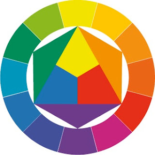
Johannes Itten - Color & the Bauhaus


"If you, unknowing, are able to create masterpieces in color, then unknowledge is your way. But if you are unable to create masterpieces in color out of your unknowledge, then you ought to look for knowledge."  ‎- Johannes Itten

Johannes Itten helped establish the Preliminary Course at the Bauhaus School in Germany, 1919. The Bauhaus changed art education and continues to influence it to this day. The non-academic Preliminary Course was designed to re-educate students from diverse educational backgrounds to new modalities. Instead of teaching theory, Itten taught through observation and process by exploring relatedness and contrasts of light and dark, textures, colors, and materials. He, along with Josef Albers, influenced generations of artists, architects, and designers. 

Link Wiki
Link Bauhaus & Itten

Rabu, 28 Januari 2009

Color Theory Online

Color, Contrast, & Dimension (in News Design) by Pegie Stark Adam

"Welcome to the interactive color experience, an online guide that explains color theory and shows how to use it in design through examples and exercises."

Poynter.org offers a well designed site with engaging and thought provoking color exercises.

Lines & Colors - Blog Site


"... is a blog about drawing, sketching, painting, comics, cartoons, webcomics, illustration, digital art, concept art, gallery art, artist tools and techniques, motion graphics, animation, sci-fi and fantasy illustration, paleo art, storyboards, matte painting, 3d graphics and anything else I (Charley Parker) find visually interesting. If it has lines and/or colors, it's fair game."

Design 21 - Use Design for Social Good


"DESIGN 21: Social Design Network’s mission is to inspire social consciousness through design. We connect people who want to explore ways that design can positively impact our communities – ways that are thoughtful, informed, creative and responsible."

In partnership with Unesco, this site offers designers and design students of all kinds - audio/visual, communication, industrial, fashion, and environmental - a place to test and use their knowledge and skills for social change through competitions, feature stories, discussion forums, and by addressing non-profit organizations needs for design services. 

Link Design 21 

Wolf Kahn - Six Good Reasons Not to Paint a Landscape


Renowned landscape painter Wolf Kahn lectures at Wheaton College, Norton, Massachusetts. This is one of a broad and excellent Forum Network series of streaming audio and video lectures offered on the web by WGBH, Boston. RealPlayer required.

Link Wolf Kahn
Link Forum Network
Link RealPlayer

Sabtu, 24 Januari 2009

Wordle - Online "Word Cloud" Generator


"Wordle is a toy for generating 'word clouds' from text that you provide. The clouds give greater prominence to words that appear more frequently in the source text. You can tweak your clouds with different fonts, layouts, and color schemes. The images you create with Wordle are yours to use however you like. You can print them out, or save them to the Wordle gallery to share with your friends."

Paul Rand, Again - Comments


What is aesthetics, art, design? What is form and content? How can we use these questions and their answers to help us be better designers, painters, photographers or sculptors? By addressing these questions, we may better know how to move forward...

Link  Paul Rand Web Site

Jumat, 23 Januari 2009

Restoring Rembrandt - Step by Step


Even if you are lucky enough to own a masterpiece, how do you know if it is the authentic version? Has it been overpainted and altered by others to reflect each owner's tastes? Here are examples of four different versions of a Rembrandt self-portrait and how it changed back into the original.

Link BBC News, In Pictures: Restoring Rembrandt

Test Your Color I.Q. - Online Game


Click on the link. Drag and drop the colors to and arrange them in the correct hue order. 
It's challenging. What did your score?

Painting by Paul Klee

Betty Edwards - Online Game


In Drawing on the Right Side of the Brain, Betty Edwards writes a great deal about the conflict between our verbal and visual modes of thinking. Observing and learning to draw is - in part - about finding ways to overcome this conflict and think visually, spacially. She offers an online exercise to illustrate these points. Try it. 

Blind Contour Drawing


Richard Bell reads and does several of the blind contour exercises in Dr. Betty Edward's book, Drawing on the Right Side of the Brain. Blind contour is a basic principle of her book. Why is it so important? Is it just as important to advanced artists too?

Rabu, 21 Januari 2009

Sketchcrawl! - Drawing Marathons For The World


SketchCrawl is a World Wide event conceived by Enrico Casarosa. On a preset day, people from different corners of the world sketch, journal, and then - thanks to the Internet - share their results with others through online forums.

Basically, the idea is to record nonstop everything around you during the course of a day. Create a drawn journal filled with details - where you go, what you do, who and what you see, what you drink and eat. 

Giving yourself this kind of freedom to draw for a full day changes the way you look at the your world. It allows you to stop and see things just a tad longer, a bit deeper, and sharing this with others allows them to visit the experience. 

Link Sketchcrawl!
© Image by Enrico Casarosa

Selasa, 20 Januari 2009

Lending a Hand - A Game


Go to the National Gallery of Art website, search the painting collection and select five paintings containing what you consider to be the most interesting hand or hands. E-mail the information back to this blog. The most creative and interesting submissions will be posted.

Your selections may be from paintings from any era or style, single or multiple figures, narrative or not. There are no restrictions on the number of hands or what they are doing. The hand or hands may be a single detail or from the entire painting. 

Link National Gallery of Art, Washington DC
 Jacque-Louis David, Napoleon in His Study at the Tuileries, 1812, NGA

Senin, 19 Januari 2009

Etch-A-Sketch Online


For many adults, the Etch-A-Sketch by the Ohio Art Company holds significant memories of their childhood drawing experiences. For children of a certain age, it is still holds delight and mystery. 

How many times did you try to make a steady diagonal line or remove enough of the silver to reveal the drawing mechanism behind the screen? Did you ever try to completely clear it? Click on the link below to 'etch' with an online version. 

Link History

Sabtu, 17 Januari 2009

Flash Drawing - Reclining Woman


There is something curious and fascinating about watching the drawing process. The process is revealing, mysterious, and a bit magical. How a person thinks and what they know is revealed through their drawing decisions. How a drawing acts on us and causes a reaction seems mysterious. And, it is magical to see the process unfold to become a meaningful pictorial presence. 

Click on the link or title to see an unknown artist draw a reclining woman.

Perception - Hybrid Images & MIT

The facial expressions of this image will change from different viewing distances. Up close viewing reveals one expression. Further back, the expression changes. What's this all about anyway?

"Hybrid images change interpretation as a function of viewing distance. Hybrids combine the low-spatial frequencies of one picture with the high spatial frequencies of another picture producing an image with an interpretation that changes with viewing distance. In this figure, the people may appear sad, up close, but step back a few meters and look at the expressions again."

Exploring the complexities of the brain and vision leads to some surprising and remarkable findings. For the visual artist, this information encourages a deeper understanding and appreciation for the complexities and possibilities of perception while reaching across academic disciplines.

Jumat, 16 Januari 2009

"How We Met" by tracecats


This very creative YouTube video combines drawing with live action and uses a "stop motion" animation technique. To find out more about it click on the link below.

Link Wiki

Kamis, 15 Januari 2009

An Outer Space - geoGreeting...how geeks show they care.


Use the planet, GoogleEarth, and NASA to send an email to anyone. Click on the link to find out more. Very clever...

Pictorial Space - Assyrian Panels


This is a relief gypsum sculpture guarded the throne room at the palace of Ashurnasirpal II in Nimrud (ancient Kalhu, the Assyrian capital) and is dated 883-859 BC.

Click on the image, carefully look at the pictorial space and study the visual cues indicating space and position. Is the space shallow, deep, both? What are the relationships between the head, torso, hips and legs? Is he walking, standing, or both? Is he facing us, turning away, or both? How much space is between his torso and and the deer? Is it shallow, deep, or both simultaneously?

If you look long enough at the image, a tension between the 2D and 3D begins to occur - an oscillation of the pictorial space. To see this, the way we view the image must be an active - and not a passive - process. What can we take from this experience and apply to our own pictorial efforts?

Link British Museum
Image © Trustees of the British Museum

Selasa, 13 Januari 2009

Fold-Ins, Past & Present - Mad Magazine


An interesting interactive feature from a New York Times web page allows you to view and 'fold'  Al Jaffee's Fold-Ins from Mad magazine. The Fold-Ins are located on the last interior page of the magazine (1960's to present). The reader folds the page as directed to reveal a second comical image in answer to a question. Instead of the significance of the viewer's  position in actual space, it relies on the viewer to reconfigure the content of the two-dimensional image with a surprising new result.

Link New York Times
Link Mad Magazine

Julian Beever


Similar to Felice Varini, British artist Julian Beever uses a specific point of view for his work to convey meaning. What tools does he use to create these elongated chalk drawings?

Link web site
Link Wiki

Senin, 12 Januari 2009

Abelardo Morell


Abelardo Morell, Professor of Photography at Massachusetts College of Art and Design, explores spacial issues with the camera obscura and brilliant use of juxtaposition.

Link web site

Felice Varini


This painted image (or installation) was created by the Swiss artist, Felice Varini. At first, it appears as a photograph of a simple white interior space with red circles drawn on it. In reality, it is a projection/construction painted on the interior that presents this experience from a unique view point. You might say it acts on our sense of the second and third dimensions and offers the viewer unique spacial experiences. What do you think?

Link More Images
Link Wiki

Minggu, 11 Januari 2009

What is Pictorial Space?

"But, after all, the aim of art is to create space - space that is not compromised by decoration or illustration, space within which the subjects of painting can live." 
Frank Stella
Pictorial Space is elusive to most, ill defined to some, and oversimplified by others. What is it, anyway?  The Concept of Space in Twentieth Century Art by Christopher Tyler and Amy Ione tackles this topic. 

Link Article
Link Frank Stella

"What is Art?" Leo Tolstoy Responds...


The great Russian novelist, Leo Tolstoy, writes an essay on the purpose and meaning of Art.

Link Essay
Link Biography

Rock Stars as Painters


Rock Star Gallery in Scottsdale, Arizona specializes in fine art by...

Grace Slick - Jefferson Airplane and Jefferson Starship
Ronnie Wood - The Rolling Stones
Ringo Starr - The Beatles
Janis Joplin 
Jerry Garcia - The Grateful Dead
Paul McCartney - The Beatles
Jimi Hendrix

 How does celebrity, in any field, shape and color the transmission and comprehension of ideas - visual or otherwise? Are there expectations and qualitative implications? Are we able to see the work for what it is? Conversely, how does lack of celebrity influence the communication and comprehension of ideas? Does it matter?


Sabtu, 10 Januari 2009

Obama's 'Hope' Portrait Headed to Smithsonian


Who says Art doesn't matter? Shepard Fairey's work became the iconic symbol for the Obama campaign and a similar image graced the Time magazine cover. Now, it's part of the permanent collection of the Smithsonian National Portrait Gallery. Additionally, a new design by Mr. Fairey commemorating the Inauguration has just been released by the Presidential Inaugural Committee. 

Link   Source - Huffington Post Article
Link   National Portrait Gallery
Link   Official Inaugural Store

"What is Art?" Creature Comforts Responds...


This may be the most definitive definition yet! What are your thoughts?

Jumat, 09 Januari 2009

iscribble.net - Shared Online Drawing 2


This looks to be the mothership of interactive drawing sites - very active! 
What do you think about interactive drawing? 
What does one learn from these collaborative experiences?

Draw Pad -Shared Online Drawing


Interesting sociological insights into shared and anonymous online behaviors.

Draw Pad V2.o lets you draw live with others on a shared drawing pad.
Select different colors, line widths, chat live with other visitors via webcam or keyboard.

"Join the fun and draw online with other connected users in our shared drawing rooms. Start drawing anything you like or help other users finish their own drawings. Create a free account to draw using your own nickname."

Kamis, 08 Januari 2009

"Style and Culture"

Artspeak?


Words like "nice, inspired, juxtaposed, -isms, duality, investigate, en plein air" are used with some authority all the time in the art world. What these terms might really mean and does usage sometimes cloud our understanding?

Funny and thoughtful insights into the strange language of artspeak by Jason Brockert.

Link

Rabu, 07 Januari 2009

Design, Form, Content


In a fascinating discussion, Paul Rand says, "All art is relationships, all art." He confronts these basic questions: Q. What is design? A. Design is the relationship between form and content. Q. What is form and content? A. Content is the idea and form is how you treat the idea.

How do we talk about these important questions that results in better paintings, better design?

What do you think?

Source: Paul Rand, Conversation with Students, by Michael Kroeger & Paul Rand, Princeton Architectural Press, 2008

The John Tusa Interviews on BBC Radio 3


A significant resource of interviews, transcripts, and recordings, exploring the creative process with people in the arts, such as:

David Sylvester
Frank Auerbach
David Hockney
Frank Gehry
I.M. Pei
Howard Hodgkin
Tom Stoppard


Selasa, 06 Januari 2009

"Arts Matter"


 A very cogent and important argument about the arts and why they matter to all of us by John Tusa - a must read. Click on the title link.

Minggu, 04 Januari 2009

"Only a Blur"


Art Critic John Haber writes about Rembrandt.
Click on title above for the article, or to read more of his writings about everything art at his extensive blog/website:

Link

Sabtu, 03 Januari 2009

Rembrandt and Composition


Portraits present unique challenges with respect to pictorial composition. This is one reason landscape and still-life might be used to explain and explore compositional ideas. The ideas are far more accessible and obvious.

But perhaps because of these difficulties, portrait composition will reward us with more valuable information? Generally, what methods are used to analyze the compositional structures of painting or drawing? Are there more interesting and productive ways of looking at portrait composition? In the case of this self-portrait, what is the content (ideas) and how does the form create it? What do you think?

Einstein Quote of the Day

"The most beautiful experience we can have is the mysterious. It is the fundamental emotion that stands at the cradle of true art and true science..."

Jumat, 02 Januari 2009

"How to Talk to an Artist"


Well intentioned, often naive questions and statements artists hear repeatedly with alternative suggestions and commentary. "How to Talk to an Artist" provides some very humorous and thoughtful insights. Click on the title to link.

10 Optical Illusions in 2 Minutes


Another YouTube with an entertaining look at how the camera and context can alter and influence our perceptions. Click on the title for viewing.

"Best Optical Illusion I've Ever Seen"


Is it the best you've ever seen? Click on the title for a brief YouTube about color perception.

Online Tracing, Bitmap to Vector Images

Upload your images, convert them to vectors, simplify color/value relationships - an excellent and quick tool that can be used to analyze general value and color structures of paintings and drawings. Try it at the title link above or click here for more information.

Kamis, 01 Januari 2009

Paul Cezanne

Euan Uglow

Stanley Lewis

Elmer Bischoff

Rembrandt


What Painters & Why? - A Meme

List 5 painters are you thinking about now and answer why? 
Limit yourself to ten words for each artist. Give credit to Ken's Blog. Link your answers back to: http://kenconleys.blogspot.com.  Tag new people to participate. 

1. Rembrandt - drawing, remarkable expressive possibilities
2. Cezanne - awareness of the picture plane, composition, color
3. Uglow - drawing in relation to the picture plane, the figure
4. Stanley Lewis - his understanding of pictorial space
5. Elmer Bischoff - color/light, marks, spontaneous & responsive painting


Split Brain Insights - Right Brain/Left Brain


Fascinating YouTube video looks at brain function, including excellent examples of visual, verbal experiments. 
Related Posts Plugin for WordPress, Blogger...